【SwiftUI】Button - 基礎編 -
SwiftUIのUIパーツについても取り上げいきます。今回はそのButton編。
Buttonについてのまとめてみました。


目次
1).基本の形
2).タップ範囲
3).配置
4).角丸、シャドウ
1.基本の形
Buttonの基本の形は下記です。
てボタンの上にテキストだけ表示させた例です。
てボタンの上にテキストだけ表示させた例です。
・コード
Button(action: {
    // タップされた時の処理を記述
}) {
    // ボタンを表すView並びを記述
    Text("button1")
}
・ スクリーンショット

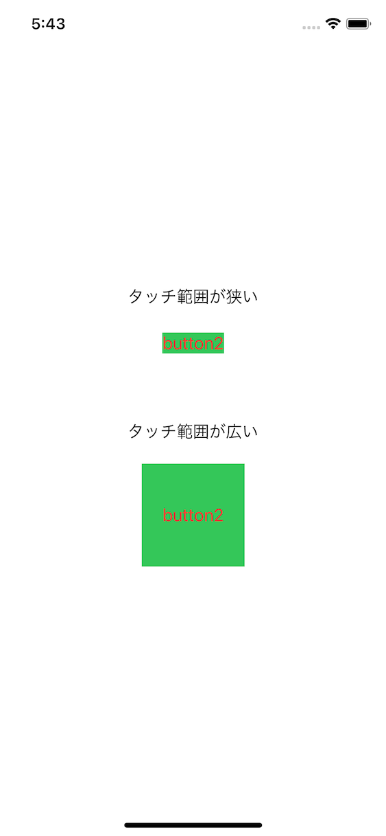
2.タップの範囲
タップの範囲エリアをframe(width:xxx,height:xxx)で指定してますが、下記の例1では、タップ範囲が狭いです。タップ範囲は、Button内の表示内容に指定した方がタップ範囲が広くなります。例2のようにTextにframe指定を付けた方が広くなります。
・コード
//例1: スクリーンショット画面上部のButton表示
  Button(action: {
    // タップ時の処理を実装
   }) {
     Text("button2")
    .background(Color.green)
    .foregroundColor(Color.red)

  }.frame(width: 100, height: 100)

//例2: スクリーンショット画面下部のButton表示
    Button(action: {
    // タップ時の処理を実装
  }) {
    Text("button2")
    .frame(width: 100, height: 100)
    .background(Color.green)
  .foregroundColor(Color.red)
  }
・ スクリーンショット
3.配置
以下にアイコンとテキストの配置例とコードを記載します。
例1では横並びに、例2ではアイコンとテキストのスペースを0にしてます。例3は縦並びの表示になります。
・コード
//例1: 横並び
  Button(action:{
    //タップ時の処理を実装
}){
    HStack(){
        Image(systemName:"square.and.arrow.up")
        Text("button1")
    }
    .frame(width:100,height:100)
    .accentColor(.red)
    .background(Color.yellow)
}

//例2: アイコンとテキストのスペースをゼロにする
    Button(action:{
    //タップ時の処理を実装
}){
    HStack(spacing: 0){
        Image(systemName:"square.and.arrow.up")
        Text("button2")
    }
    .frame(width:100,height:100)
    .accentColor(.red)
    .background(Color.yellow)
}

//例3: アイコンとテキストを縦並びにする
//例2のHStackをVStackに変更
    Button(action:{
    //タップ時の処理を実装
}){
    VStack(spacing: 0){
        Image(systemName:"square.and.arrow.up")
        Text("button2")
    }
    .frame(width:100,height:100)
    .accentColor(.red)
    .background(Color.yellow)
}
・ スクリーンショット

4.角丸、シャドウ
以下にアイコンとテキストのボタンで、角丸とシャドウの例を掲載します。
・コード
//例1: 角丸をつける
Button(action: {
    //Action
}, label: {
    HStack(spacing: 2) {
    Image(systemName: "magnifyingglass")
    Text("Search")

    }.frame(width: 130.0,height:30.0)
    .foregroundColor(.white)
    .background(Color.blue)
    .cornerRadius(10)
})
**********************************
//例2: 影を更につける。例では赤い影をつけている
Button(action: {
    //Action
}, label: {
    HStack(spacing: 2) {
    Image(systemName: "magnifyingglass")
    Text("Search")

    }.frame(width: 130.0,height:30.0)
    .foregroundColor(.white)
    .background(Color.blue)
    .cornerRadius(10)
    .shadow(color: .red, radius: 3, x: 2, y: 3)
})
**********************************
//例3: クリック時の色を反転させる
Button(action: {
    //Action
}, label: {
    HStack(spacing: 2) {
    Image(systemName: "magnifyingglass")
    Text("Search")

    }
    .frame(width: 130.0,height:30.0)
})
.buttonStyle(CustomButtonStyle())

//-- ButtonStyleでボタンを定義
//-- ここでボタンアクションでの色を変更している
struct CustomButtonStyle: ButtonStyle {
    func makeBody(configuration: Self.Configuration) -> some View {
        configuration.label
            .foregroundColor(Color.white)
            .background(configuration.isPressed ? Color.red : Color.blue)
            .cornerRadius(10.0)
            .shadow(color: .red, radius: 3, x: 2, y: 3)
    }
}

**********************************
//例4: クリック時にアニメーションさせる
Button(action: {
    //Action
}, label: {
    HStack(spacing: 2) {
        Image(systemName: "magnifyingglass")
        Text("Search")

    }
    .frame(width: 130.0,height:30.0)
})
.buttonStyle(CustomButtonExpandStyle())


//-- ButtonStyleでボタンを定義
//-- ここでボタンアクションでの色を変更している
struct CustomButtonExpandStyle: ButtonStyle {
    func makeBody(configuration: Self.Configuration) -> some View {
        configuration.label
            .foregroundColor(Color.white)
            .background(configuration.isPressed ? Color.red : Color.blue)
            .cornerRadius(10.0)
            .shadow(color: .red, radius: 3, x: 2, y: 3)
            .scaleEffect(configuration.isPressed ? 0.7 : 1.0)
            .opacity(configuration.isPressed ? 0.4 : 1)
    }
}
・ 動画