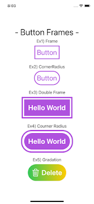
【SwiftUI】Button - 応用編 - リンクを取得 Facebook × Pinterest メール 他のアプリ 4月 24, 2021 前回の基礎編に引き続き、応用編として色々なボタンを試してみます。 下記のようにボタンを画面に表示してみました。コードも下記になります。 ・スクリーンショット ・コード リンクを取得 Facebook × Pinterest メール 他のアプリ
【SwiftUI】グラスモーフィズムを試してみました 5月 16, 2021 🤔 グラスモーフィズムって? すりガラスの表現を利用した半透明の表現方法でガラスの向こう側がすりガラスによって曇って見える表現が特徴です。iosでは今更ですが、MacOSのBig Surに利用されていることから、2021年のデザインのトレンドとして挙がっています。 🤔 では、どのような画面表現があるのか? ・Dribbbleでは? https://dribbble.com/tags/glassmorphism ・Pinterestでは? Pinteresetで検索すると、Osamu Furukawaさんのボードに掲載がございます。以下にリンクを掲載します。 https://www.pinterest.jp/omfull/%E3%82%B0%E3%83%A9%E3%82%B9%E3%83%A2%E3%83%BC%E3%83%95%E3%82%A3%E3%82%BA%E3%83%A0glassmorphism/ 🤔 どんな表現が可能なのか? 以下のスズキアユミさんのサイトがまとまってますので、リンクとして掲載します。 https://designmemo.jp/creative/glassmorphism.html 🤔 SwiftUIで表示できるの? 試した結果、SwiftUIのみでは表現が難しそうです。Blurの表現ありますが、ただのViewに くもりガラス風の表現 をするのは難しく、UIViewRepresentableで拡張したUIVisualEffectViewというパーツが必要になるようです。 ここまでで、やったこととして、Figmaで以下のように簡単なデザインしました。 figmaのプラグインで、SwiftUIインスペクターを利用してSwiftUIのコードを出力してiPhone画面に表示してみました。以下のようになります。オレンジの四角形と黄色い三角形部分が上にのっているViewで薄く表示されてますが、 くもりガラス風な表現になってはいません。 UIVisualEffectViewを利用すると以下のような表現になります。オレンジの四角形と黄色い三角形部分が上にのっているViewがくもりガラスのようになりました。 くもりガラス... 続きを読む
アプリアイコンの素材探し 8月 15, 2021 はじめに iOSアプリ開発で利用するアイコン素材をネットで探してみた アイコン画像について、ネットのアイコンを利用するとき ライセンスを確認すると思いますが、直近調べたものを記載しました。 続きを読む
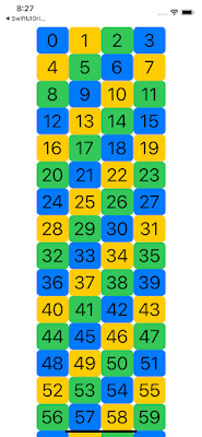
【SwiftUI】LazyVGridについて 4月 30, 2021 1.LazyVGrid, LazyHGridについて 今回は、SwiftUIのLazyVGridについて取り上げます。 iOS14からLazyVGridとLazyHGridが利用できるようになりました。UICollectionViewを使って表現していたグリッドデザインをSwiftUIではLazyVGrid,LazyHGridを利用して表現します。以下の表示例をみていきましょう。 2.表示例:4列の固定幅のViewを持つLazyVGridの表示 1) スクリーンショット 2) コード 3.上記コードについて 1) LazyVGridのインスタンスについて LazyVGrid(colomns: [GridItem], alignment: VerticalAlignment, spacing: CGFloat?, pinnedViews: PinnedScrollableViews, content: () -> _) ※LazyHGridの場合は、colomnsのラベル名がrowsに変わります 引数の各要素は以下のようになってます ・rows: → GridItem の配列を指定。 ・alignment: → 行の配置を .center .top .bottom のいずれかを指定 ・spacing: → 行と行の間隔を指定 → ・LazyVGridの場合、行間のスペースを変更します。 ・pinnedViews: → ヘッダーとフッターを固定するかどうかを指定する。ヘッダーの場合は .sectionHeaders を、フッターの場合は .sectionFooters を指定します。 cf)Apple Documentaion: LazyGridView.init 2) 要素のGridItemについて GridItemは要素のサイズ、要素数を定義します GridItem(GridItem.Size, spacing: CGFloat?, alignment: Alignment?) ・GridItem.Sizeについて → 以下の種類があるようです。 fixed:固定サイズを指定 flexible:可変サイズ(最小・最大指定)をして ... 続きを読む
