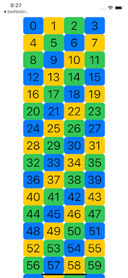
【SwiftUI】ProgressiveViewについて
iOS14で追加になった、ProgressiveViewについてみていきます。ProgressiveViewの種類は、CircularProgressViewStyleとLinearProgressViewStyleの2種類があります。前者はくるくる回るプログレス表現で後者は、バー状に伸びるプログレス表現です。
1. CircularProgressViewStyle
いくつかのパターンを画面表示して、その時のコードを以下掲載します。
This file contains hidden or bidirectional Unicode text that may be interpreted or compiled differently than what appears below. To review, open the file in an editor that reveals hidden Unicode characters.
Learn more about bidirectional Unicode characters
import SwiftUI | |
struct ContentView: View { | |
var body: some View { | |
VStack(spacing: 50.0){ | |
HStack(spacing: 0.0) { | |
ProgressView() | |
.padding(.all, 10) | |
Spacer().frame(width: 20.0) | |
//サイズ2倍 | |
ProgressView() | |
.scaleEffect(x: 2, y: 2) | |
.padding(.all, 10) | |
Spacer().frame(width: 70.0) | |
//サイズ5倍 | |
ProgressView() | |
.scaleEffect(x: 5, y: 5) | |
.padding(.all, 10) | |
} | |
HStack(spacing: 10.0) { | |
ProgressView() | |
.padding(.all, 10) | |
.scaleEffect(x: 2, y: 2, anchor: .center) | |
.padding(.all, 16) | |
.progressViewStyle(CircularProgressViewStyle(tint: Color.red)) | |
ProgressView() | |
.padding(.all, 10) | |
.scaleEffect(x: 2, y: 2, anchor: .center) | |
.padding(.all, 16) | |
.progressViewStyle(CircularProgressViewStyle(tint: Color.blue)) | |
ProgressView() | |
.padding(.all, 10) | |
.scaleEffect(x: 2, y: 2, anchor: .center) | |
.padding(.all, 16) | |
.progressViewStyle(CircularProgressViewStyle(tint: Color.green)) | |
} | |
HStack(spacing: 10.0) { | |
ProgressView() | |
.padding(.all, 10) | |
.scaleEffect(x: 2, y: 2, anchor: .center) | |
.padding(.all, 16) | |
.progressViewStyle(CircularProgressViewStyle(tint: Color.red)) | |
.background(Color.black.opacity(0.1)) | |
.cornerRadius(10) | |
ProgressView() | |
.padding(.all, 10) | |
.scaleEffect(x: 2, y: 2, anchor: .center) | |
.padding(.all, 16) | |
.progressViewStyle(CircularProgressViewStyle(tint: Color.black)) | |
.background(Color.gray.opacity(0.1)) | |
.cornerRadius(10) | |
ProgressView() | |
.padding(.all, 10) | |
.scaleEffect(x: 2, y: 2, anchor: .center) | |
.padding(.all, 16) | |
.progressViewStyle(CircularProgressViewStyle(tint: Color.green)) | |
.background(Color.red.opacity(0.1)) | |
.cornerRadius(10) | |
} | |
} | |
} | |
} |
2. LinearProgressViewStyle
バー状に伸びるプログレス表現については、.NETゆる〜りワークさんのサイトが大変参考になります。以下をご参照ください。